Most of the guidelines below apply to common English for both the web and print in most contexts. However, keep in mind that my advice on writing styles is based mostly on non-fiction, American English on the web.
Writing.
Write what you know.
This is without a doubt, the most regurgitated piece of advice on writing. Why? Because it’s true and it’s good advice, period. No matter how trivial or epic your experiences and knowledge are, there’s a niche for it. Whether you paint lines on roads or climb mountains, there’s an interest.
The point is this: climbing mountains might sound funner to read and write about, but if you’re not an expert on mountain climbing, and you’re an expert on painting lines on roads and highways, you should be writing about painting lines on roads. Bottom line, if you want to gain readers and earn their respect and loyalty, you better know what you’re writing about.
Put the time in.
Try and put as much time, research, and sometimes references in your writing as you can to pack more value for the reader. Try not to leave things out and think about it from the reader’s perspective. What more might they want to know? Put in the time and you’ll give your writing the well-needed substance and credibility that is required to engage readers.
Write naturally.
Unless you’re writing fiction or a textbook, write naturally. I try my best to write as though I was talking to a friend, albeit, I usually don’t say words like “albeit” in-person and perhaps there is a little bit more obscenity in my free-flow, live conversations. Just write freestyle (within reason) to build your character as a writer. I’ve noticed that the more I write, the more I loosen up, and the more I loosen up, the more my readers seem to respond to me. Though it’s just text, there is still a tone and voice to be found from a writer.
Spelling.
We all have spellcheck, but you’d be surprised how often people forget to use it (or simply don’t care). Sometimes, your browser’s dictionary won’t recognize a word as it’s either too new or it hasn’t been officially included yet. In those moments, use Google, which is more hip on new words and will even auto-correct them, for the most part. If it doesn’t, try and look around the search results for the most reoccurring spelling of that word. You’ll see a pattern in what’s commonly used.
In this Web 2.0 (going on Web 3.0) age, capitalization has new meaning in spelling things correctly. Easy example: FaceBook, Face Book, and facebook are all incorrect. It’s spelled correctly as Facebook. You might find that silly and trivial, but it’s not. It’s an important indication of professionalism and credibility. If I was reading a tech article where the author spelled Facebook as Face Book, I would instantly think this writer is a little sloppy, lazy, or uninformed, so how good is any of their advice going to be?
Right spelling; wrong word.
…let me know of others to add.
Avoid 50¢ words.
A 50¢ word is a word that’s unnecessarily obscure or fancy or snobbish, when there’s a simple word more widely understood that could be used instead. A writer tends to use these words to sound more intelligent, yet wouldn’t the smartest thing to do be to write in a way that the most people possible could understand you (and not have to look up the definition of words)?
Examples:
- intelligent = smart (oops)
- esoteric = obscure
- ubiquitous = everywhere
- panacea = catch-all
- diatribe = rant
- concept = idea
- approximately = about
- commence = begin
- endeavor = try
- finalize = end
- objective = goal
- empirical = observable
- tantamount = equal
…let me know of others to add.
Now, don’t get me wrong. I use 50¢ words all the time, depending on the context. All words have value, and a time and place, but if you’re just using a 50¢ word purely to sound smarter, without any other valid reason, it might be a bit much.
Shouldn’t be pluralized; commonly is.
- anyways
- towards
- forwards
- backwards
- upwards
- downwards
- inwards
- onwards
- afterwards
…let me know of others to add.
British English Variants — In the UK, the addition of the “s” is sometimes favored. So, in some contexts, like how the spelling of certain words are varied (example: colour), technically, it may not be incorrect.
Definitions.
As my vocabulary grows, I find all sorts of interesting (and 99% of the time, accurate) words popping into the flow of my communication, whether speaking or writing. However, I still look up the definitions of words over and over and over again to verify it means just what I’m trying to convey. Again, Google is a wonderful tool to this end. With search operators, we can directly look up definitions, like so:
Grammar and punctuation.
Without a doubt, sentence structure is extremely important. Though, my knowledge in this area is limited to what I’ve learned so far (being that I’m all self-taught). I am still learning and always learning more, everyday. An expert could probably pick out many technical errors in this very article. However, its readability to the laymen I would say is well-put-together.
Arguably, my worst problem would be run-on sentences. However, the method to my madness is to write with such a high level of specificity that almost anyone should be able to follow. I’ve learned this from the many years of working with clients and providing customer service.
Although I’ve happily accepted being a “run-on-sentence” or “stream-of-consciousness” kind of writer, I still care about learning the proper use of commas, semi-colons, etc. You’d think it would be a matter of reading the proper use definitions once, but it’s not. It takes practice practice practice to improve as a writer.
Even the most seasoned of writers will still come in contact with issues that stump them. Mainly, language is not fixed. It continues to evolve and there really are no absolutes. Even today, there are differences of opinion on how some things should be structured, the meanings of words, etc. Personally, I’m of the school of thought that there’s no right or wrong way to do anything, only different ways.
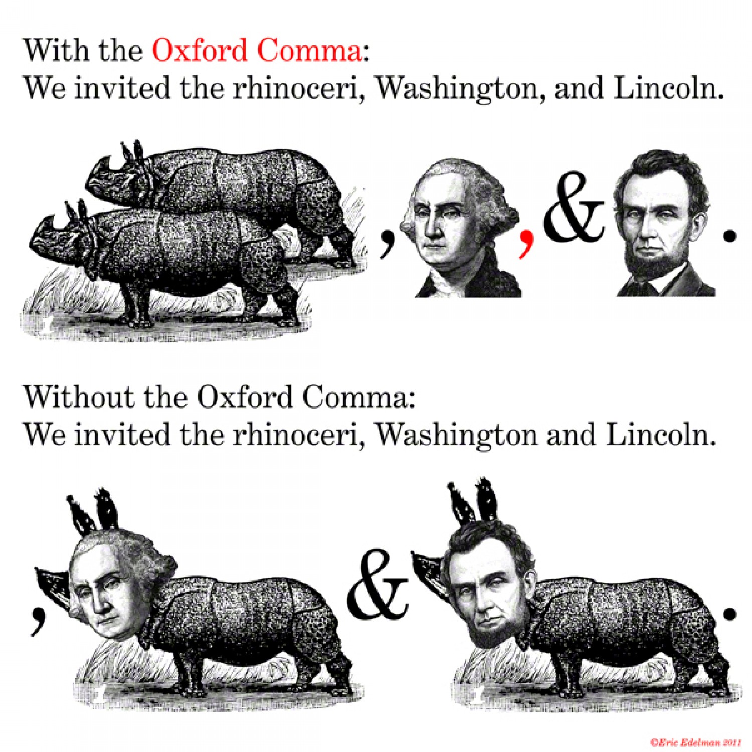
That said, no one likes to be misunderstood. That’s why I’ve adopted such standards as the Oxford comma, for example.
Ultimately though, the technicalities here are less important than the natural flow of words. Read what you write aloud (including pauses and stops). Would you speak this way? Does it sound off? This goes back to writing naturally.
Paragraphs.
Years ago I used no paragraphs whatsoever. Either because I was afraid of them, or because I simply just didn’t know any better. It was finally pointed out to me one day in a forum, along the lines of:
“Start using paragraphs! I can’t read your giant wall of text dude.“
This likely stemmed from my run-on way of speaking. This didn’t seem like a problem to me then, but in retrospect those big giant walls of text are horrible on the eyes and I feel the same “face-palming” moment when I see others write this way today.
Paragraphs can be tricky; not too big and not too small. Too big and we’re still just looking at big blocks of text. Too small and it just looks like chopped up sentences.
Proofread.
When all is said and done, proofread, proofread, and proofread again. The method I use is to proofread until I can no longer find any more errors, and then to read it one last time all the way through in a lighter, more “fresh eyes” kind of approach to see how it goes over, flow-wise. As opposed to reading in a very technical and analytical way, trying to spot issues.
Readability.
Unfortunately, many writers don’t have full control over this. Why? Because it’s in the hands of a webmaster or publisher as to how your words are aesthetically placed.
Headers and sub-headers.
Hierarchy is important for three reasons:
- Structure: to show what section we are still in
- Readability: to break things up for the eyes
- SEO: for writing on the web, this has a positive impact
Example of typical heading sizes and styles:
Header 1
Header 2
Header 3
Header 4
Header 5
Header 6
I would recommend not going more than three nested headers deep for basic, non-technical writing. I don’t believe I’ve ever had to. If you do, it might be more important to perhaps organize your writing better.
Contrast.
A lot of grays have been in use since the Web 2.0 look (more like the ’60s if we’re talking print), but the golden rule for the content copy is always solid black words against a solid white background. There is certainly room for creativity, as long as it isn’t at the expense of the reader. Avoid graphics behind text unless done very subtly, for example.
Typography.
This can be challenging and many differ in opinion as to what the most readable font is. As far as print, anything can be used at a high-resolution, so it has a wider amount of choices. However, for web-use, there are very few fonts that are considered “web-safe.” I would argue that Arial (essentially Helvetica) and Georgia (similar to Times) are the most readable, aesthetically pleasing common fonts.
I’ve currently adopted the system font method.
Font size.
While 16px (approx. 14pt or 1em) is the recommended font size for readable paragraph content and is the default size for many web browsers, 14px is the most commonly used size for online content. Many complain that 14px is too hard to read. Of course, it depends on the font used and other factors as well. I prefer to use 16px+.
Line height.
This often needs to be adjusted.
What’s easier to read?
This sentence will be called sentence 1.
This sentence will be called sentence 2.
OR
This sentence will be called sentence 1.
This sentence will be called sentence 2.
In my fussing around, I’ve found that 145% is a pretty good sweet spot for line-height.
Word spacing.
This rarely needs to be adjusted.
What’s easier to read?
This sentence will be called sentence 1.
This sentence will be called sentence 2.
OR
This sentence will be called sentence 1.
This sentence will be called sentence 2.
Letter spacing.
This rarely needs to be adjusted.
What’s easier to read?
This sentence will be called sentence 1.
This sentence will be called sentence 2.
OR
This sentence will be called sentence 1.
This sentence will be called sentence 2.
Paragraph indentation.
I see no reason to use this in the online context. — Disagree? Comments are welcome.
Padding, margins, and borders.
This rarely needs to be adjusted.
What’s easier to read?
This sentence will be called sentence 1.
This sentence will be called sentence 2.
OR
This sentence will be called sentence 1.
This sentence will be called sentence 2.
Line-height, word and letter-spacing, padding, margins, and borders often go overlooked as being considered extremely important to whether a writer’s work will be read with ease or not. I think it is extremely important.
Conclusion.
Writing and readability are actually more difficult than I’d like to admit. I myself, am still struggling to find that perfect formula. But, it’s a worthy goal to keep tinkering with.
Reading is very intimate and psychological and I’m trying to create comfort for the reader. At this point, I think I’ve just spent too much time thinking about it so maybe I need some fresh eyes. I hope you’ll give me your feedback on the readability of my articles. Thanks.