I’m a big movie and video game buff. So, naturally, I’m a huge fan of cinematic games. I’ve an especially fond liking of Rockstar Games, primarily the GTA series.
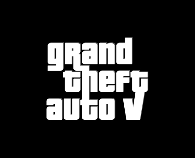
As a fan, I felt like designing and sharing a logo design concept for GTA 5 (which isn’t released yet) just for fun. Hoping for an October, 2012 release date.
My GTA 5 fan logo concept:
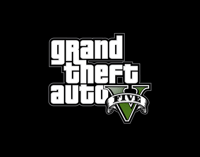
The official GTA 5 logo:
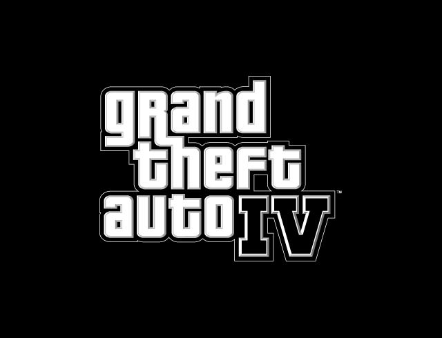
The official GTA 4 logo:
As you can see, the GTA logo usually consists of more embeveling, strokes, and outlines. I wanted to freshen up and modernize it a bit with a cleaner, more minimalist look for 2011-2012.
The font I used, made famous by the wild popularity of the GTA series, is called Pricedown. Designed by font designer Ray Larabie.
I got a chance to speak with Ray and ask him about the font and his relationship with Rockstar (an interesting tidbit for other Rockstar or typography fans I’m sure):
“Coincidentally, I was working at Rockstar when they used the font but they had no idea that it was from one of their own employees. The original UK packaging used a sort of sixties retro font from House Industries. I think it was just before I started working on GTA London 1969 when they started using Pricedown for the GTA US packaging. I worked in the Toronto studio tho, the packaging and other promo stuff was done in their new NYC office but we didn’t have much contact with them. I was consulted about the Vice City logo but my only recommendation that they draw it with a marker as opposed to using a font.”
Perhaps you’re not a GTA fan or even play video games at all. But, lovers of graphic design, fonts, and typography, or anyone alike really, are welcome to critique the design.


